

Watercolour for Beginners: Session Four
We are going to take a little side-step this week to gain some understanding about colour theory.
It’s one of my favourite topics within art but it isn’t for everybody, some of you may love the science behind it and some of you may want to run screaming and get to Part 5. No matter your opinion, spend a little time on the technicalities if you can as they WILL help enormously with the relationship between colour and composition.
What you will learn this session:
Understanding paint colours
What primary colours are
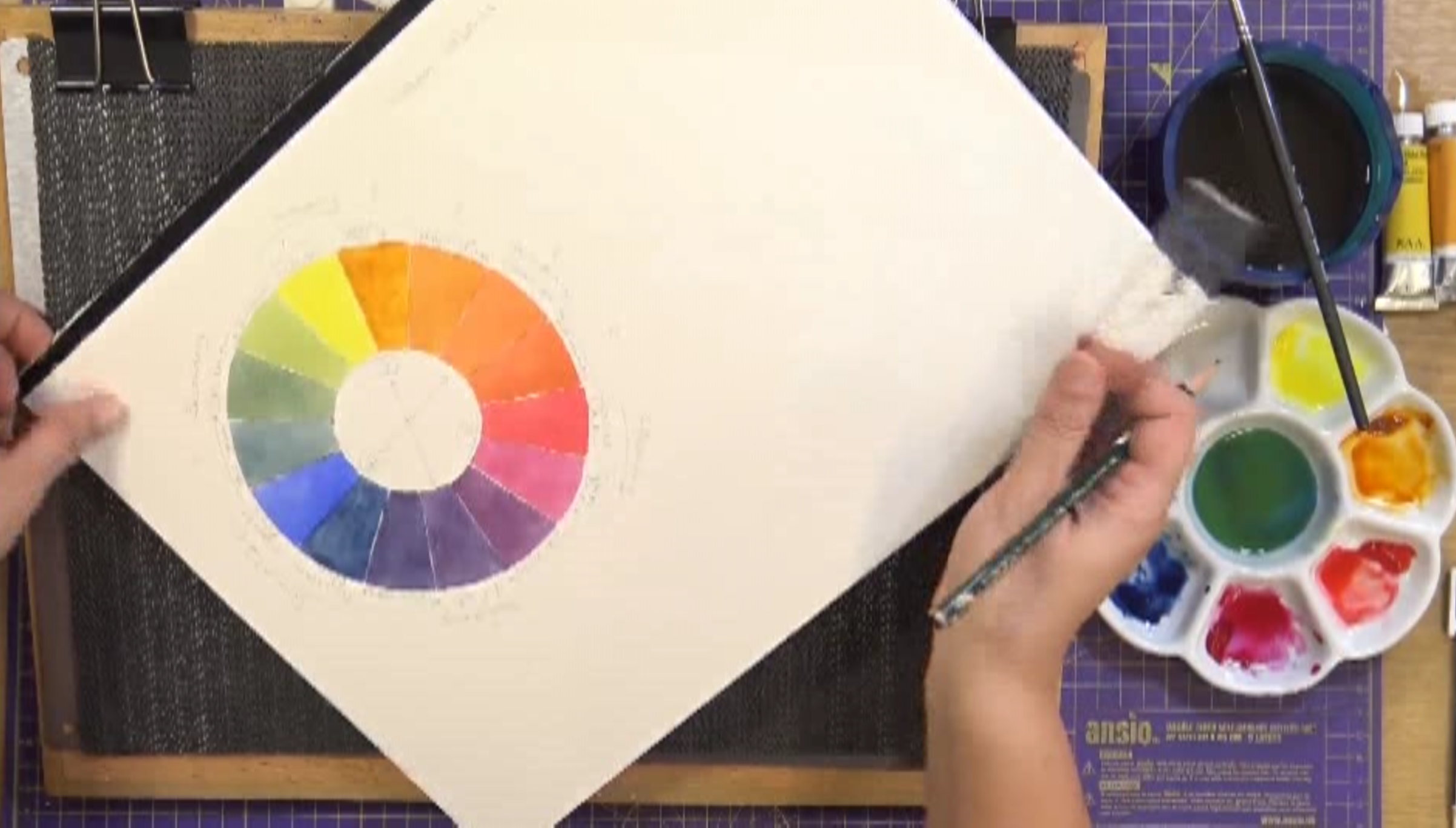
A six colour primary system
What secondary colours are
Understanding colour bias
Constructing a colour wheel
Complimentary pairings
How to mix the colour you want, when you want it
The equipment you will need in addition to previous sessions:
(Please note that this was filmed in 2021 and I have possibly altered the equipment I now use due to manufacture and availability. My online shop on this website has the most up to date versions of what I now recommend)
A selection of watercolour paints (please watch the tutorial for more information)
If you would like to do the mathematical version of the colour wheel then you will need a compass, protractor and a ruler. It might be worth watching the footage first to see how I construct it.
The tutorial:
Timings within the video when Ali discusses particular aspects of the exercises:
0:52 - Why do we need to know about colour theory
2:06 - Introduction to materials
6:55 - Primary Colours
8:42 - Colour Bias
17:11 - How to construct a colour wheel
24:10 - Labelling the wheel
28:55 - Filling in the primaries
42:40 - Mixing Secondaries
51:08 - Biased Secondaries
1:02:10 - Labelling the wheel Part 2
1:03:50 - Colour Temperature
1:07:16 - Relatable Colours
1:07:47 - Complimentary pairings
1:15:46 - Additional colours for nature
Glossary of Terms:
(Taken from the Collins Dictionary of Art Terms and Techniques)
PRIMARY COLOUR: One of the three chromatic colours from which all others may theoretically be obtained. Red, yellow and blue are the three paint primary colours.
Ali’s definition: This is a great explanation of the term.SECONDARY COLOUR: Any of the three colours that are a result of mixing the three pairs of Primary Colours. Orange, Violet and Green are the three paint secondary colours.
Ali’s definition: This is a great explanation of the term.
TERTIARY COLOUR: Any colour produced by a mixture of secondary colours.
Ali’s definition: I don’t exactly agree with this, I believe it to be a mixture of a primary and a secondary. 1+2=3…COLOUR BIAS: No entry in CDATT.
Ali’s definition: A colour that possesses the characteristics of either its description or what it is being used to create. E.g. Lemon Yellow has a green bias.COMPLIMENTARY PAIRING: A pair of colours usually considered to be in extreme contrast to each other.
Ali’s definition: This is a pretty good, concise definition without going into further depth.
COLOUR TEMPERATURE: No entry in CDATT.
Ali’s definition: The artistic concept that the perceived temperature of colour (either warm or cool) will make it advanced or recede for the viewer.
Homework:
By no means compulsory, homework is only suggested to allow each participant the opportunity to expand on what they have learnt in this session:
This week has been very theory-heavy and I tend to find that people either love it or want to move on from it as quickly as possible. As you have access to this information for as long as you wish, you find it useful to return to it when you have progressed a bit further. If it is something that really interests you, there is plenty to be found in books or on the internet for you to expand your knowledge.